Our previous article, ‘UX Design: 5 golden rules to elevate your in-house software solutions‘, explored how AEC professionals can harness decades of research into user experience to improve their in-house software solutions. This article continues the discussion by looking at a significant component of user experience, the user interface. We’ll explore some of the out-of-the-box solutions, such as Dynamo Player, and how to overcome some of its limitations. For those needing more bespoke solutions, we’ll also look at how to go about designing your own using third-party plug-ins, such as HumanUI and Rhino.Inside Revit.
UX vs UI: What’s the difference?
The terms ‘User Experience’ (UX) and ‘User Interface’ (UI) are sometimes used interchangeably. However, there are distinctions between the two. UX is about understanding how a user will experience the software – where they will look to find a command, what they expect to happen when a button is pressed, or what they will do when they get stuck.
On the other hand, user interfaces are where interactions between a user and the software occur. There are many different types of UIs, including command-line interface such as MS-DOS; graphic user interfaces such as Microsoft Windows; and voice-enabled user interface such as Amazon Alexa.1
Case study
A good user interface is more than a few input sliders in a window. Done correctly, user interfaces can eliminate complexity and improve the user’s experience. For example, we recently created an app for one of our clients to visualise and analyse the shortest path between hospital departments.
Hospitals often have an extensive schedule of accommodations, each with precise requirements about its proximity to other areas. Since Revit 2020, it has been possible to calculate the shortest path using the ‘path of travel‘ feature. The user simply selects two points in a floorplan, and Revit calculates the shortest route between those 2 points, avoiding elements defined as obstacles.
However, because the tool was designed primarily for egress compliance, it doesn’t consider vertical distances, as staisr and elevators typically do not contribute to the travel distance calculations. But when considering adjacencies, it can often be quicker to go via an elevator to a different floor than to be on the same floor and walk. Therefore, to get meaningful shortest paths, not only do we need to consider horizontal travel paths, but we also need to consider vertical travel paths.
Settings
As shown in the video above, the shortest path is automatically calculated for each department to every other department. The route may be horizontal, or it may include a vertical segment via an elevator. The analysis method is set via the main user interface using HumanUI and can be run using either distance (meters) or time (mins). Different rates can be set for walking speed (m/sec), elevator wait time (sec), and vertical elevator speed (m/sec). The results are then used to colour-code the various paths:
- White: <1:15 min
- Yellow: 1:15 – 2:30 min
- Orange: 2:30 – 3:45 mins
- Red: >3:45 mins
Heads Up Display
Results are then compared against the brief. The HUD, via Conduit, displays an interactive, colour-coded adjacency matrix:
- Blue: Department located close but without a need.
- Green: Department is adequately positioned.
- Red: Department is too far away.
Since so many paths of travel can cause cognitive overload, paths are hidden by default. Only once the user selects the department in the UI does the associated paths show. Overall, the tool enabled the architects to continue working in their preferred method, but with the added benefit of continual feedback about its performance.
As demonstrated via this case study, a good user interface can play a proactive role in designing better buildings. The good news for us is that many out-of-the-box solutions exist which can assist us. But before we jump into solutions, let’s explore a bit more about the user interface and our relationship to them.
UI frameworks
Graphic user interfaces are how most people interact with any software. The design of these UIs often starts as a blank canvas, with the designer(s) progressively adding to it until it is a completed product. However, a UI framework is often adopted to eliminate inconsistencies and improve efficiency. The framework consists of a system of design standards, templates, and components that are used throughout a product and serve its design language.

Microsoft Windows users will probably already recognise the Windows Presentation Foundation (WPF) framework, used since Windows 7, and the newer Universal Windows Platform (UWP) framework used in Window 10. These frameworks provide the look and feel of Windows. The framework’s limitation, however, is that they only work on Windows-based PCs. To achieve cross-platform functionality for both a Mac and PC, UI frameworks such as Electron have emerged, which function more like a web app than traditional desktop software.
Visual programming
CAD/BIM user interfaces, in general, has changed very little over the years. Users are well accustomed to a central drawing/modelling area, a tabbed ribbon up the top, and various pallets on the side. However, with the emergence of visual programming, first with Grasshopper in 2007 and later in 2011 with Dynamo, new ways of interacting with the software have emerged.
Users no longer need to write textual code to achieve any sort of automation. Instead, users can drag and drop ‘components’ (Grasshopper) or ‘nodes’ (Dynamo) onto a canvas and wire them up. For many, however, the ‘spaghetti’ created by all of these wires is still too overwhelming. Various user interfaces have emerged as a way of overcoming this barrier to entry, radically simplifying the interaction between a user and the visual programming software. These user interfaces represent an additional layer on top of the main graphic user interface.
Grasshopper
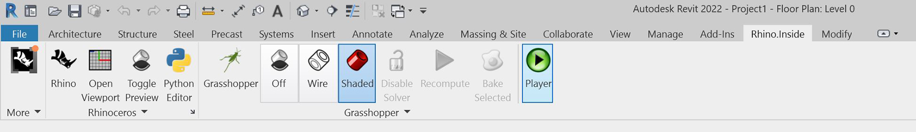
Grasshopper is the visual programming interface for McNeel Rhino 3D, and while dedicated Revit users may be tempted to gloss over this section, this is short-sighted. With the release of Rhino.Inside Revit, certain Grasshopper UIs can now be exposed within Revit. Natively, Rhino.Inside Revit has its own Player, which can be accessed via the ‘Rhinoceros’ tab in Revit.
However, much like the original version of Dynamo Player, it simply executes a definition without providing a dedicated UI for user inputs. This limitation means that, as it currently stands, the Rhino.Inside Revit Player isn’t very beneficial. However, it can be used to launch your own Grasshopper scripts, which has the user interface already built-in. For example, we’ve been testing the possibilities with our MetricMonkey user interface. And while we are still in the early days, the initial results are extremely promising.
HumanUI
Another approach of visualising a user interface via Rhino.Inside Revit, is to use the HumanUI plug-in. Under the hood, HumanUI uses the Windows Presentation Foundation (WPF) framework mentioned earlier, meaning it only works on Rhino for Windows. Styling, which controls the visual appearance of elements, such as text box or pull-down menus, is pre-set using MahApps.
Significant modifications are required to convert a Grasshopper script into a HumanUI compatible script, which is its main limitation. UI elements must first be created, and then their default value set until finally their value is read from the UI. Therefore, it is relatively easy to inadvertently get the sequence wrong, causing the UI to be refreshed multiple times. However, once mastered, HumanUI is extremely powerful and versatile. Indeed, we used HumanUI for our initial proof-of-concept for MetricMonkey.
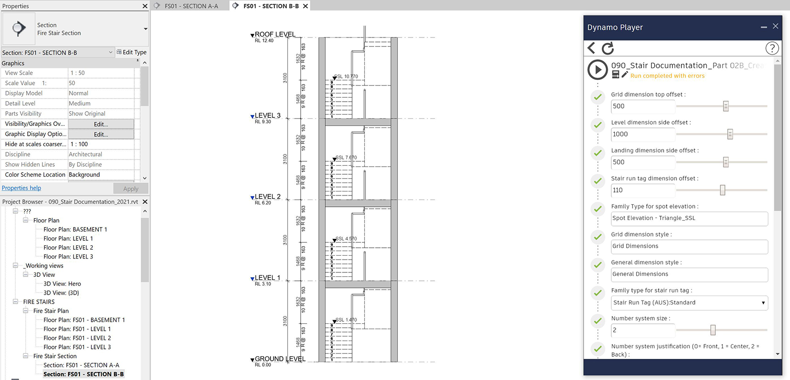
Dynamo Player
Dynamo Player provides a simple user interface for executing Dynamo scripts in Autodesk Revit. It was first introduced with Revit 2017.1, but it was not until Revit 2018.1 that Dynamo Player allowed user inputs. Only minor modifications are required to make a Dynamo graph compatible with Dynamo Player. Mainly this entails specifying which inputs are exposed in the Player by right-clicking the node and enabling the ‘IsInput’ setting. There are limitations about the types of inputs that Dynamo Player can read, but mostly it is ensuring you use a ‘standard’ parameter like a number or text instead of a code block. Once set up, a user can simply point the folder directory to your central repository and see the complete list of available Dynamo graphs. Inputs can be modified as needed via the UI and then run by pressing the Play button.
Over the years, we’ve developed countless Dynamo graphs for our clients. During this time, we’ve observed how a user experiences the software and the problems they frequently come across. While undoubtedly Dynamo Player has lowered the entry barrier to computational design, there is still plenty of room for improvement. Here are some of the main user experience issues we’ve discovered and how they can be addressed:
Issue #1: Dynamo Player uses the oldest version of Dynamo installed
If you have two versions of Dynamo installed, for example, 1.3 and 2.0, Dynamo Player will always default to the oldest version. The is problematic because those two versions of Dynamo are not compatible. The only way to overcome this is to either uninstall all 1.X versions (preferred). Alternatively, force Dynamo Player to use the latest version by first opening up Dynamo, selecting the version you want to use, close Dynamo, and then launch Dynamo Player. Both approaches offer seriously poor UX. This issue appears partly fixed as of Revit 2020 as the Dynamo version is now tied to the Revit version. However, this doesn’t help those still using older Revit versions.
| Revit Version | First Stable Dynamo Version | Last Supported Dynamo for Revit Version |
|---|---|---|
| 2013 | 0.6.1 | 0.6.3 |
| 2014 | 0.6.1 | 0.8.2 |
| 2015 | 0.7.1 | 1.2.1 |
| 2016 | 0.7.2 | 1.3.2 |
| 2017 | 0.9.0 | 1.3.4 / 2.0.3 |
| 2018 | 1.3.0 | 1.3.4 / 2.0.3 |
| 2019 | 1.3.3 | 1.3.4 / 2.0.4 |
| 2020+ | 2.1.0 – Revit 2020+ now includes Dynamo and receives updates as Revit does.) | N/A |
Tip #1:
If you are working in Revit 2017-2019, uninstall Dynamo 1.X unless you absolutely need it.
Issue #2: Dynamo Player doesn’t order graphs alphabetically
Dynamo Player can list all the Dynamo graphs located in a folder. However, these are ordered based on the date/time they were created and not alphabetical as one would typically expect. This limitation makes finding the graph you are after tricky.
Tip #2:
Cut and paste files from one folder to another, essentially re-creating the files so that they display in alphabetical order.
Issue #3: Dynamo is unable to accept user inputs mid-operation
Out-of-the-box, neither Dynamo nor Dynamo Player is capable of accepting user inputs mid-operation. This limitation means that a user must define all inputs before running the graph. While most of the time, this isn’t problematic, there are many use cases when having the ability to abort an operation is useful. This is where Rhythm comes in.
Rhythm is a Dynamo Package developed by John Pierson, and it allows users to create a simple Windows message from Dynamo. We’ve used this, for example, as a makeshift progress indicator to warn people how long an operation may take. The user may choose to cancel and wait until lunchtime before running the graph for a lengthy process.

We’ve also used it to provide feedback to users that there is an error before they run the entire graph, only to find out it was never going to work in the first place.
Tip #3:
Use Rhythm’s ‘Helpers.SimpleUserMessage’ node for feedback, and the ‘Helpers.UserMessage’ node to interrupt a graph mid-process.
Issue #4: Dynamo Player doesn’t use element binding
Element binding is when Dynamo tracks what it has already created so that if the graph is re-run, elements are modified instead of duplicated. For Revit, element bindings are saved in the Dynamo graph, not the Revit file. The problem, therefore, arises because Dynamo Player does not save the Dynamo graph. Under-the-hood, Dynamo Player is opening Dynamo, running the graph, and closing the file without saving. This limitation means that element bindings also aren’t saved. Re-running a Dynamo Player, therefore, will create duplicate elements. This issue, unfortunately, doesn’t have a solution. At best, a user must undo or delete the previously created elements and then re-run the graph, which is far from ideal.
Tip #4:
If element binding is critical to the workflow, run the graph in Dynamo instead of Dynamo Player.
Issue #5: Dynamo Player doesn’t provide help and documentation links
Despite our best intentions, it may not be immediately apparent what the user needs to do for the graph to work as expected. Consider, for example, annotation in Revit, which are view-specific. If we wanted to create annotations and the Dynamo graph had been written to reference the active view, our active view in Revit when running Dynamo Player is essential. But how is a user to know this before pressing play?
One of the guiding principles of interface design is to provide help and documentation for those that need it. Any such information should be easy to search, focused on the user’s task, list concrete steps to be carried out, and not be too large.2 However, Dynamo Player provides no such features.
Tip #5:
Create an additional input with the label ‘instructions’.
While this is far from ideal as the instructions display as an editable text box, at least it provides some guidance for the user. Another approach is to rename an input with complete instructions. This approach appears visually cleaner in Dynamo Player but is difficult to edit in Dynamo.

When it comes to errors, again, Dynamo Player doesn’t offer much in terms of help. Once completed, Dynamo Player displays “Run completed” or “Run completed with errors”. There is no description of what the error was, and what is even more frustrating is that it displays this error when it isn’t an actual error but a warning. To provide some level of feedback to the user about what may have gone wrong, you’ll need to create your own custom error messages
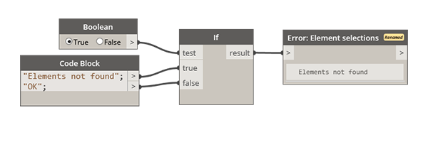
Tip #6:
Combine a ‘Watch’ node with an ‘IF’ node. Different ‘errors’ are then reported depending on the result.
Issue #6: Dynamo Player can not be customised
Apart from reordering inputs and defining their type (text, number, etc.), there is no further customisation possible within Dynamo Player. However, many Windows users will be accustomed to standard dialogue boxes, taking them through a process, one step at a time. And this is where Data|Shapes come in.

Data|Shapes is a Dynamo Package that enables you to create custom user interfaces. Various elements can be added to the interface, including list pickers, logos and hyperlinks to help files. The great thing about this approach is that you can still use Dynamo Player to initiate the graph but then switch to the Data|Shape UI for all user inputs and interactions.
Tip #7:
Daisy chain multiple Data|Shape UIs together to enable step-by-step decision making.
One limitation with Datas|Shapes is that the UI doesn’t display correctly if you have changed the scale of apps in your Window’s display settings. This limitation can lead to truncated ‘select all’ and ‘select none’ labels, making it difficult for the user to know what is what.

Conclusion
Good user interfaces keep it simple by eliminating complexity. They use common UI elements to provide legibility and consistency. But most importantly, a good user interface dramatically improves your user experience and encourage you to keep using the tool. So if your desire is to do better things, consider the user interface’s role in your next in-house software solution.
References
1 Babich, N. (4 Oct 2019). What are the similarities & differences between UI design & UX design?
2 Nielsen, J. (24 April 1994). Nielsen Norman Group. 10 Usability heuristics for user interface design.