This article explores how Architecture, Engineering and Construction (AEC) professionals can harness decades of research into User Experience (UX) to improve their in-house software solutions. The article draws on research from two pivotal players in UX: Jakob Nielson, who pioneered website usability back in the 1990s, and Steve Krug whose seminal book ‘Don’t make me think’1, is still regarded as the bible for web developers. To illustrate some of the best-practice principles, I’ll be referencing our feasibility software, MetricMonkey.
Don’t make me think
As a general rule, people don’t like to puzzle over how to do things. Thinking is hard work, and we are programmed to reserve effortful thinking for when it really matters. In our article, ‘Identifying Innovation Opportunities‘, we explained the science underpinning this phenomenon by presenting psychologist and economist Daniel Kahneman’s work. In his work, Kahneman describes two systems in the mind: System 1, which operates automatically and quickly; and System 2, which allocates attention to the effortful mental activities.2
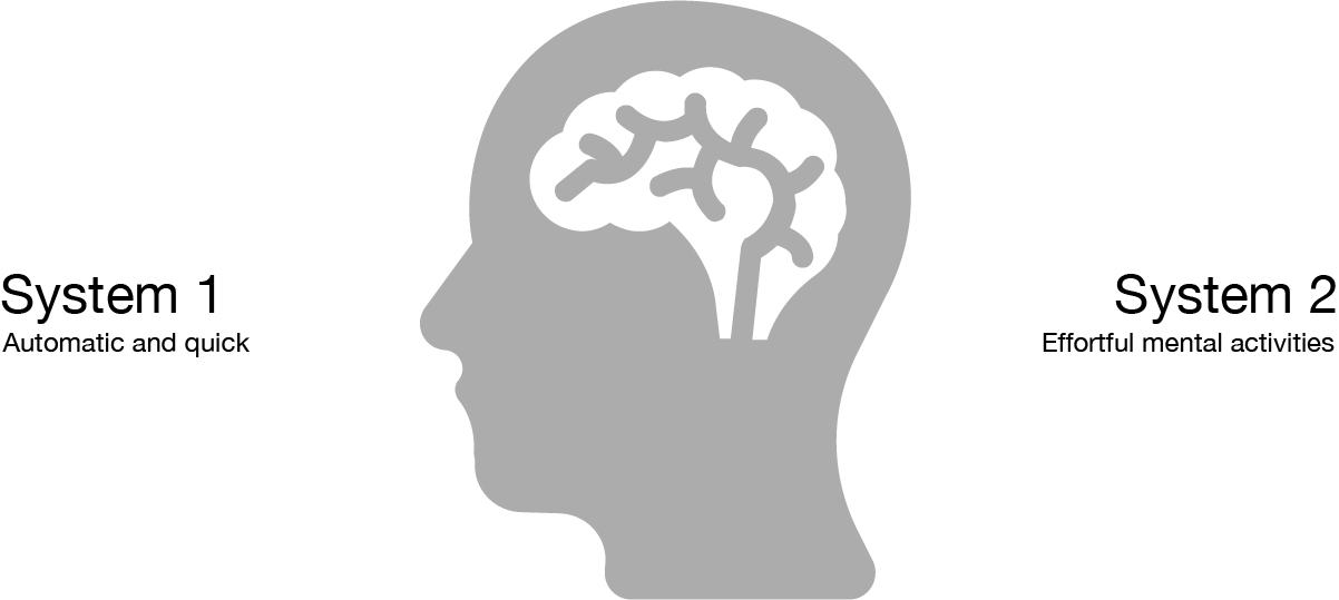
Good UX aims to use System 1 thinking, which means it needs to be self-evident or intuitive. You should be able to ‘get it’ – without expending any effort thinking about it. Every question a user has, adds to our cognitive workload, distracting our attention from the task at hand.3 The golden rule of UX is, therefore, don’t make me think.
Why is UX important?
Who can forget ‘Clippy’, the bouncing paper clip providing unsolicited advice to Microsoft Word users? Clippy is famous for being one of the worst user interfaces ever deployed to the mass public. Despite Microsoft harnessing social psychologists to develop it, there were early signs Clippy was destined to annoy users.

Focus groups made frequent references to his ‘leering’ eyes. However, failing to heed their criticism, Microsoft pressed ahead, including Clippy into Microsoft Office 97. After wide-spread user dissatisfaction, Clippy eventually met his end in 2007.4 Although it would seem Microsoft didn’t learn from their mistakes, with the equally annoying PowerPoint assistant, which I’m confident no one, ever, in the history of PowerPoint, have ever used or appreciated.
UX design for AEC
When approached by organisations to develop software for them, sometimes it will be the CEO, other times, it will be the studio BIM Manager. Without exception, however, the request is usually along the lines of, “we want to automate [insert task] by doing XYZ”. While we love the fact that more and more companies are looking at scalable software solutions, what you might call product-based solutions, framing the problem as a purely technical issue is problematic on multiple levels. Firstly, a technical solution has already been prescribed before any diagnostic. And secondly, it is asking the wrong question. As Theodore Levitt famously said:
people don’t want to buy a quarter-inch drill; they want a quarter-inch hole.5
A better way to frame the question would be to ask: “How can we enable staff to [insert task]?”. While an automated routine may play a part in the solution, if staff are ignorant of the software’s existence or cannot use it – it will fail. Ultimately what is needed is behaviour change – How can I get my colleagues to do this instead of that.
Changing behaviours
Decades of psychological research has shown that we can influence others, and change their behaviour, if:
- they are motivated to do what we are asking them to do, and
- what we are asking them to do is relatively easy.6
Motivation is composed of individual incentives and social norms and is best tackled within the ‘office culture’. Whereas making something easy is a technical issue best tackled through skilling up and eliminating complexity. Skilling up can be addressed through software tutorials and workshops, as well and comprehensive documentation. While eliminating complexity is best addressed through good UX. This is why UX design is so important – it improves the effectiveness of the tool.
Usability testing
UX is more than just creating a good-looking UI. It is about fundamentally understanding how a user will experience the software – where they will look to find a command; what they will expect to happen when a button is pressed; or what they will do when they get stuck. The things that will turn out to be important will come as a surprise, even though, in hindsight, they’ll seem perfectly obvious. For this reason, usability testing is critical.
Usability testing is the process of watching one person at a time try to use something to do typical tasks so that you can detect and fix the things that confuse or frustrate them. While this might sound incredibly time-consuming, Jakob Nielson’s studies showed that 85 per cent of the problems were observed after just five people.
Testing one user early in the project is better than testing 50 near the end.7
Usability testing tends to defuse most arguments and break impasses by moving the discussion away from the realm of what’s right or wrong and what people like or dislike, and into what works or doesn’t work.8 It’s important to start testing as early as possible and keep testing through the entire development process. In a follow-up post, we’ll be discussing user testing some more, including how to incorporate it into a sprint.
Prototypes & wireframe software
Once you have formed an idea of what the software should do, it is tempting to jump in and start programming. However, our experience suggests it is better to split the ‘frontend’ User Interface (UI) development from the ‘backend’ functionality. In much the same way that you might sketch a design on sketch paper before committing it to BIM, mocking-up the UI before beginning the backend forces you to question your assumptions and how a user will engage with it.
Dedicated software designed to help you mock up a prototype is known as ‘wireframe’ software. There is plenty of wireframe software on the market such as Figma and Adobe XD. For MetricMonkey, we chose Adobe XD, which like any good software, is very easy to learn, especially if you are familiar with other Adobe products. In a similar way to visual programming, you can ‘wire up’ components to control interactions such as hovering or clicking on a button. For icons and graphics, both Google and Windows publish free design toolkits which are compatible with Adobe XD.
5 golden rules for good UX
Much of good UX comes down to common sense and best practices. The origin of many of these best-practices can be traced back to two pivotal people: Jakob Nielson, who pioneered website usability back in the 1990s, and Steve Krug whose seminal book ‘Don’t make me think’, first published in 2000, is still regarded as the bible for web developers. The rules below are by no means comprehensive and serve only as a starting point to begin your UX journey.
Rule #1 – Make it easy to find things
As Krug describes, faced with any sort of technology, very few people take the time to read instructions. Even technically savvy users often have surprising gaps in their understanding of how things work.9 For most of us, it doesn’t matter if we understand how things work or not, as long as we can use them. Take a car for example – you don’t need to know the mechanics of an internal-combustion engine – You just need to know which button to press to turn the car on. Rule number one then is to make it easy to find and do something. In web design, this is known as a Call-To-Action (CTA), and it is a piece of content that encourages the user to do something. Usually, this is a button such as ‘Try for free’, ‘Get started’, or ‘Learn more’, and it is typically the first thing you see on a page.
Example:
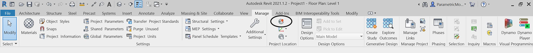
When undertaking user testing for MetricMonkey, we discovered a recurring problem – users were continually unable to find the project location settings. After witnessing this a few times and reflecting on why this was happening, we realised that we had inadvertently created the issue through years of experience using Autodesk Revit. Allow me to explain.
The project location setting in Revit is buried deep into the UI with other general settings. Emulating this logic, we placed MetricMonkey’s location settings in the Settings tab. We thought this was quite logical. But what seems so obvious now, which we didn’t realise until we saw users struggling, is that we weren’t comparing like for like.
In a BIM project, the project location is set once and then forgotten. Indeed, many Revit users may have never needed to select a project location because it was already established before joining the project. Furthermore, architectural projects tend to run for years. Even if you were tasked with setting the project location, it wasn’t something you needed to do daily.

Contrast this to a feasibility study when you are continually evaluating new sites and need to set the project location each time. Project location in this scenario takes on far more importance, especially since it influences many other functions downstream, including solar access and overshadowing analyses. In much the same way as a CTA on a webpage, the location setting needed to be the very first thing a user would see when opening the software. An easy technological fix but which only became noticeable once we had tested our assumption.
Rule #2 – Provide feedback
One of the essential guidelines for improving an application’s usability is to provide clear feedback. As Nielson explains, “such feedback can be as simple as a change of colour once the user has clicked on a button, or a progress indicator when a process needs a little longer to finish. These indicators communicate that the system is working, and reduce uncertainty – preventing users from, say, tapping the same button multiple times because they weren’t sure if the first time worked.10 Studies have shown that the graphical progress indicators mitigate the adverse effects of waiting and prolong the user’s attention. Moreover, it enables the user to feel in control and creates trust in the mechanics of the software and the brand itself. Neilson suggests the following rules for progress indicators:
- If a command takes between 2 and 10 seconds, show a wait animation such as a ‘spinner.’ This type of progress indicator tells users to hold their horses and not click on anything else until the normal cursor returns.
- If a command takes more than 10 seconds, put up an explicit progress bar, preferably as a per cent-done indicator.11

Progress bars are notoriously difficult to implement in visual programming software as it is impossible to accurately calculate how long a task will take without performing it first. This limitation is one of the reasons why neither Grasshopper nor Dynamo has one. However, it is possible to give some feedback.
Example:
In our earlier prototypes of MetricMonkey, when users clicked on the import context button, they received no immediate feedback that their action was being processed. This lack of feedback caused them to click multiple times which actually deactivated the command – making them wait even longer! We’re implementing a simple indeterminate progress bar in the snack bar at the bottom to avoid this issue.
Rule #3 – Provide default values
One of the simplest ways to minimise cognitive load is to supply default values so that the user doesn’t need to think. While this approach would be problematics in some contexts, for example, entering your name and address on a website, in the context of software, defaults can help users in many ways, including:
- Speeding up interaction,
- Learning by providing an example of the appropriate input, and
- By letting them accept the default if they don’t know what else to do.
Example:
Automating a feasibility study is an inherently complicated process due to the sheer number of variables involved. Requiring a user to populate every input field before they received any feedback would quickly become frustrating. We’ve therefore developed a MetricMonkey settings file which acts like a template, pre-populating fields. This functionality enables consistency across multiple projects for such things as floor-to-floor heights and colours.
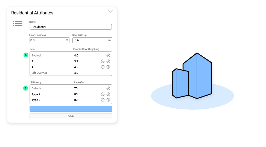
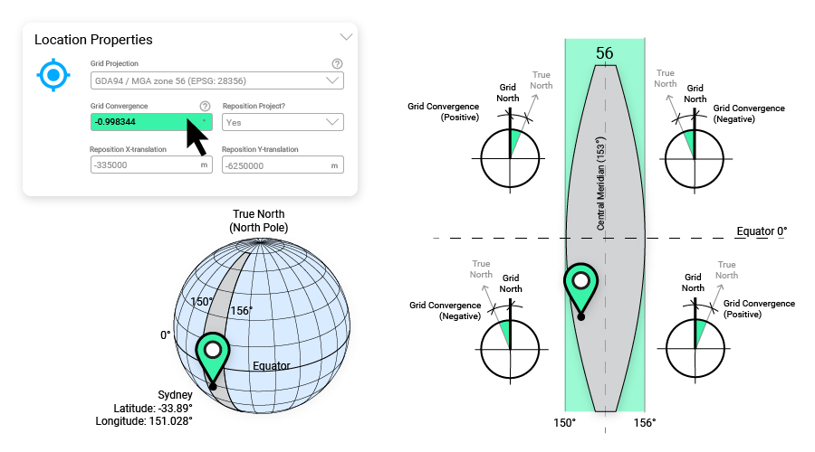
Similarly, where variables need to be set on a project-by-project basis, we’ve pre-populate associated fields with the most common value. For example, once the Project Location is set, the Grid Projection and Grid Convergence default value are also automatically set. Of course, these values can be overridden by the user, but they provide a default if the user doesn’t know otherwise.
Rule #4 – Conventions are your friend
Users have expectations for how something will behave or where they can access it. Deviations from those expectations increased cognitive load as people attempt to puzzle out the problem. Therefore to avoid confusion, naming conventions and graphic layouts should be consistent.12
As with any project, inconsistencies can creep into software as more and more people become involved. Sometimes this oversight is deliberately ignored to get the software ‘out the door’. While this approach might get your Minimum Viable Product (MVP) making money sooner, it means that users will have to unlearn knowledge that they have already acquired. Not only is this frustrating, but it is also confusing. Think back to the early days of Dynamo and the ‘List.Map’ node. Just when users had started mastering the concept, the Dynamo team introduced the List@Level method. They then spent the next couple of years re-educating users with the new process.
Example:
We’ve spent a lot of time creating comprehensive documentation for MetricMonkey. This process proved incredibility valuable. Not only do we now have engaging and informative help files for users, but we’ve also identified inconsistencies and managed to fix them before they become ingrained in a user’s memory. For example, we discovered we used the terms ‘Lot’ and ‘Plot’ interchangeably. In other areas, we referred to ‘Hide’ instead of ‘Mask’. While this might sound like semantics, words matter, and even the slightest bit of confusion causes cognitive load. Each problem encountered, lowers the ‘reservoir of goodwill’ until the user eventually gives up.13 The lesson is simple. Once you establish a convention, try to avoid changing it down the track.

Rule #5 – List commands in the frequency-of-use order
What people do most of the time is glance at each area, scan some of the text, and click on the first thing that catches their interest or vaguely resembles the item they’re looking for. Because of this behaviour, it is essential not to make a user scan through a long list of disorganised commands. To help users focus on the most appropriate options, list commands in the frequency of use.14
In architecture, we can see the effect of frequency-of-use ordering when it comes to Construction Documentation. When creating sheet sets, there are generally two schools of thought with demolition drawings. Some believe they should be placed at the front so that drawings are chronological. Others, however, believe that they are better placed at the end as demolition is one of the shortest phases of the project and once complete, the drawings don’t need to be referred to again.
Example:
With MetricMonkey, we’ve tried to guide users through the design process. This approach represents a departure from what you might find in Revit. In Revit, for example, tabs are grouped as follows: Architecture, Insert, Annotate, Analyze, Massing & Site, etc. The result of this organisation is that users are continually jumping back and forth between tabs. However, in MetricMonkey, a user simply works though each tab, more or less sequentially: Context, Site, Design, Analyse. We think this is far more logical and easier to use, and user testing confirmed our assumptions.
Conclusion
As Clippy demonstrated, any software will be a flop if it provides poor UX. AEC organisations must be cognizant of this fact when developing their in-house tools. It is critical to remember that the real challenge is less about technology and more about behavioural change. And to achieve this change, we need to ensure that the users are motivated to do what we are asking them to do, and what we are asking them to do is relatively easy. The rules presented above to improve UX are by no means exhaustive. But we hope they do provide a starting point for you to begin your UX journey so that you too can do better things.
References
1 Krug, S. (2014). Don’t make me think, revisited: A common sense approach to web usability, New Rider, Berkeley.
2 Kahneman, D. (2011). Thinking, fast and slow. Penguin Books, Great Britain.
3 Krug, S. (2014). Don’t make me think, revisited: A common sense approach to web usability, New Rider, Berkeley, p.15.
4 Rossen, J. (28 Sept 2017). The tragic life of Clippy, the world’s most hated virtual assistant.
5 Levitt, T. in Christensen, C. & Raynor, M. (2003). The innovator’s solution. Harvard Business Review Press, Boston, p99.
6 Ferrier, A. (2014). The advertising effect: How to change behaviour. Oxford University Press, Melbourne, p.16.
7 Krug, S. (2014). Don’t make me think, revisited: A common sense approach to web usability, New Rider, Berkeley, p.115.
8 Krug, S. (2014). Don’t make me think, revisited: A common sense approach to web usability, New Rider, Berkeley, p.109.
9 Krug, S. (2014). Don’t make me think, revisited: A common sense approach to web usability, New Rider, Berkeley, pp.25-26.
10 Harley, A. (3 June 2018). Nielsen Norman Group. Visibility of system status (Usability heuristic #1).
11 Sherwin, K. (26 Oct 2014). Nielsen Norman Group. Progress indicators make a slow system less insufferable.
12 Nielsen, J. & Laubheimer, P. (17 Feb 2019). Nielsen Norman Group. Top 10 application-design mistakes.
13 Krug, S. (2014). Don’t make me think, revisited: A common sense approach to web usability, New Rider, Berkeley, pp.166-169.
14 Kaley, A. (17 March 2019). Nielsen Norman Group. Contextual menus: Delivering relevant tools for tasks.